Inspiring Interior Design (Part 16)
By Asher Crispe: August 27, 2012: Category Inspirations, Quilt of Translations
Psycho-Chromatics
 With relative ease we can assign light and color portfolios and thereby generate a quick sketch of the soul. Such assignments will multiply with time but for now we must make do with justifying our selection of ‘entry level positions.’ In order to obtain complete coverage throughout the interior of our inner person (as well as our home), we must once again examine the division of black and white verses color.
First of all, black and white really address two different levels which are coupled (as we saw in our inspection of light and shadow). In that discussion, we called attention to the association of ‘black’ with darkness citing the first appearance of the word in the Torah when (Genesis 1:2): “…darkness was upon the face of the abyss.” There it was explained as the connection of darkness to the superconscious crown or keter. So too, in our context black relates to the superconscious crown.
What does this add to the overall assessment? Black is black because it does not reflect light that is within the visible spectrum. If the light is the conscious powers of the soul, it follows that the superconscious contains all of these powers. It absorbs all of them while reflecting none of them in a revealed way. Moreover ‘darkness’ or choshek in Hebrew (the kindred term of ‘black’) is said to be a permutation of the word shachack meaning ‘to forget.’ That which is kept in the dark remains temporally forgotten as in the clichéd expression: ‘out of sight, out of mind.’
Light consequently assumes the position of the intellect (enlightenment). Light here means white light. Rather than absorbing everything, whiteness reflects the entire visible spectrum and can be thought of as the aggregate of all of the colors. Thus, the status of black and white remains somewhat contingent upon color. While black may be considered achromatic, it nonetheless continues to be thought of as a color in a specialized way. Light also bears a color label. It is ‘polychromatic.’ Therefore, black and white, like zero and infinity in a number system, constitute the two exceptional states that problematize our color codes. They act as an escape route whereby color transcends color. Consequently, they might even be described as ‘chromatically uncanny.’
In Hebrew the word for ‘white’ is lavan (לבן) which according to Kabbalah is a conflation of the thirty-two wondrous pathways of wisdom (ל”ב פליאות נתיבות חכמה) and the fifty gates of understanding (נ’ שערי בינה) [Note: lavan is spelled lamed (30), beit (2) and nun (50) which the kabbalists divide into 32 for the first two letters and 50 for the third and final letter]. As a result, our ‘white’ light encodes a reference to the cognitive powers of the soul, namely wisdom (chochmah) and understanding (binah). Incidentally, the number 32 refers to the 32 times that the name Elokim (God in the guise of nature) appears in the account of Creation. Etched into the fabric of Creation, the 32 pathways signify the overall intelligibility found within the natural world. By contrast, the 50 gates of understanding represent the 50 days from Passover to the giving of the Torah on Shavuot at Mount Sinai. Each gate traversed opens the mind until it is sufficiently expanded to receive the Torah. This being said, there is not only an accentuation of structure with the use of black and white (as we mentioned previously)–the white itself contains hidden structures. It both reveals structure and lends structure to the objects that it bathes.
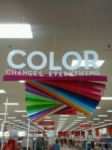
Consciousness (da’at) can now be understood as the contrast between the light and the dark, the white and the black. Moreover, in Kabbalah we learn that emotions are born out of states of consciousness just like a particular hue will issue from out of a white light through the imposition of a filter. Emotions, as the prism that unpacks the contents of our thought processes, also emphasizes some of those contents while de-emphasizing others. ‘Let us dress all in green for today.’ The monochromatic option for a particular room translates into an experience of a narrow emotional frequency. Likewise, polychromatic variety (stopping short of white which could be thought of as the polychromatic pushed to the extreme of being ‘omnichromatic’) provides a range of moods or emotional mixes.
Linking color to emotion can also help us comprehend the kabbalistic insistence on having an emotional palette of only seven general spheres or measured character traits (middot). In Hebrew, the primary word for color is tzeva which closely relates to the word shevah meaning ‘seven.’ Furthermore, it also closely resembles the word tevah or ‘nature.’ From this we learn that emotional colors are naturally featured as seven types. The seven colors of the rainbow, the basic branches of the visible spectrum, correspond in one to one proportion with the emotive attributes.
Another equally important connection can be uncovered in the etymology of an alternative Hebrew word for colors: gavanim. This form of color is very closely related to the word nigunim which means ‘melodies.’ The sub-root of both words is simply gan or ‘garden.’ We might suggest that both the hues and the tones are ‘garden’ variety in the sense of naturally occurring. Our seven natural colors (or the natural world which is based on the number seven) are reflected within the seven notes of the musical scale. Tones and hues unite. Colors and music have long been know to correspond in direct proportion in this fashion. Therefore, pressing a person’s emotional ‘buttons’ works well once you know the color code and the appropriate musical notes.
Henceforth, when we compose with music we need to consider the musical colors of our composition and how it affects the mood of the listeners. Each note or series of notes or chordal progressions evokes a feeling or feelings. Just as we strive for musical harmonies, we also must pursue color harmonies. The synesthesia of the audio-visual underscores the emotional balance that can be achieved with the arrangement of the right color composition.
Dipping into the interior of the soul once more, we will mix and match colors to the seven specific emotions in Part Seventeen.


;)
;)
;)
;)
;)
;)
;)
;)
;)
;)
